Since completing our first critique we have made changes with our application based on the feedback we gained in that session. The changes that we have made have contributed successfully towards the development of our application, which we are very pleased about. Since the last time we have still been attending all of our sessions that have took place and each time we have also completed our milestones. We had a check-in a few weeks ago and that turned out successful to and we have made progress since.
CURRENT STATE:
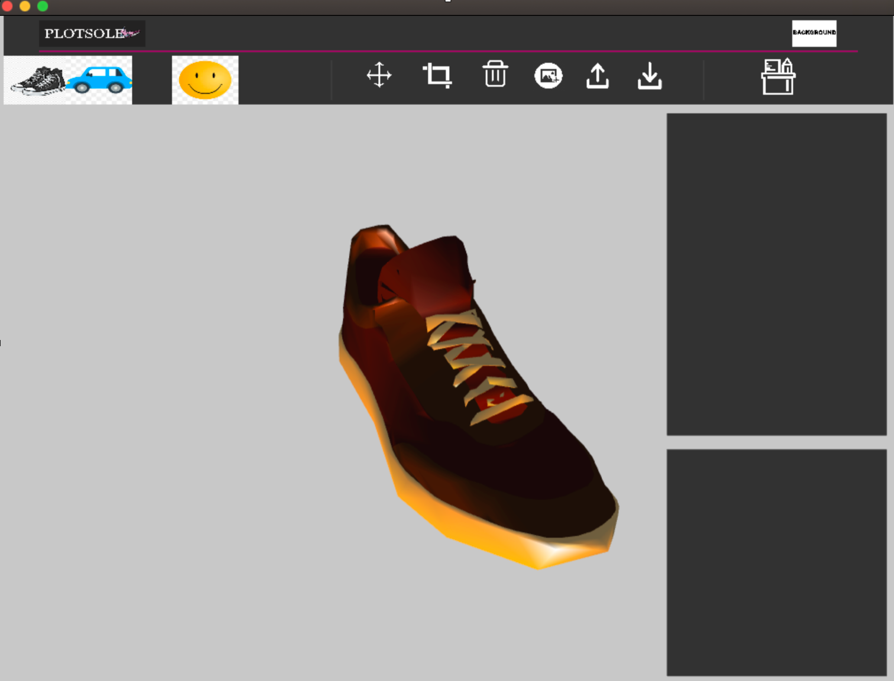
At this stage in our project we have completed our naive version where we have combined a paint program, the layout and a 3d object orientation program which helped to outline our project. We did have a few issues with getting the 3D environment to correspond with our layout program. Part of the issue was that we we combined the 3d environment to the layout we had issues with the displaying of the layout as soon as we pressed the 3D button to allow our 3D object to appear. It was as if the code for the layout began to stop working as soon as we created a 3D layer to activate an object. We the fixed this by re-arranging the code and making sure that statements were in the correct order to ensure we weren’t calling anything before it had been declared or initialised. Sorting out the code allowed us to continue with our work, leading on the development of our buttons. Whilst implementing the standard buttons that we needed on our paint program like draw and erase, we also implemented the feature where users can contribute their own images of their device to the 3d environment / paint program. This was suggested to us by our peers in our first critique and we thought that it would be a great feature to add alongside our others.
FEEDBACK:
Our positive comments from Alex & Zami:
Both Alex and Zami stated that the composition of our application was very neat and clearly labeled, making it easy for a user to interact with.
Our Critique from Alex and Zami:
As a part of the critique, they mentioned that we should apply a hover feature that highlighted the icons when the users hovers around it. That way it would make it more clear to users which buttons they were pressing, defining what action they want to proceed with. The name of the button should also appear when users hover over It to make it clear what action that button performs as sometimes icons aren’t clear enough for users. They also stated that we should implement a limit on the sizes of images that users can upload to protect our memory usage and to make sure that users aren’t dropping images with huge amounts of data which will slow down the application.
Our positive comments from Michael & Aktar:
Both stated that we had a very clear and comprehensive layout. It showed similarity to other editing software which means that it would easier for users to get their head around and interact with.
Our Critique from Michael and Aktar:
They thought that it was a great idea to add the feature that allowed users to add their own images to the application but they also said that it might be a good idea to then make sure that users can delete that image if needed or remove it. Similar to Alex and Zami, they thought that creating a hover feature for the icons would be a good idea and also wanted us to think about maybe making the icons 3D so they stand out a bit more.
Based on the feedback that we received from both groups we wanted to implement some of the features that they suggested. We both thought that implementing a hover feature would be practical and work out better for user experience, along with potentially making the icons 3D allowing them to stand out. We will try and implement these features in time for the displaying of our 2nd prototype.