After gaining some feed back on the prototype A version of our project we decided to implement some changes that users suggested in our feedback. Below explains all the thought processes and the changes that came with it.
We also developed a basic prototype that helped us to improve our overall layout of the program
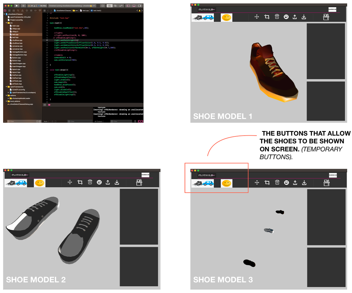
SHOE SELECTION & BUTTON INTERACTION:
The first change that we wanted to make apparent was creating 3 separate buttons that allow us to toggle between 3 different loaded shoe models. The first quest was to create a simple program that displayed a simple key pressed toggle, using ‘a’ to show shoe model 1, ‘b’ for shoe model 2 and so on. We created a small application in openFrameworks that demonstrated these actions and we committed it to our git repository. After developing that we then needed to think about how we would then add this feature to our actual program that we are currently developing. We had some issues at the start but they were quickly resolved when we began to re-order our code and separate things properly and in order.
LAYOUT & BUTTON DESIGN:
The second change that we wanted to make within our application focused on the development of a new layout involving some more complex button interactions such as hovering. Written below are some stages and processes that we went through in order to reach the next stage of development for our application.
Button Interaction Research:
We researched into some more in-depth topics surrounding UI/UX interaction, looking at what are the most common and user friendly button styles. We want to better our user experience with our app and improving the design of our buttons will help to do so. We either want to change the initial look of the buttons or allow the style of the button to change once the user interacts with it.
We cant assume that the interaction is obvious just because we can interact with it easily. We developed the application so of course it will be easy for us to navigate around. Our users are the ones that will be navigating around the application without our physical commentary, therefore we need to make sure that the user interaction is top notch and to make sure of that, there are a few things that we need to consider.
Things we wanted to consider:
Make the buttons look like buttons
Put buttons where users expect to find them
Label buttons with what they do
Properly size your buttons
Take note of the order and organisation of the buttons
Avoid using too many buttons
Provide visual feedback of user interaction with our application
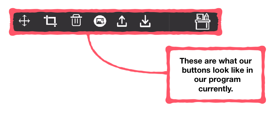
SIMPLE BUTTON DESIGNS
One way that we can improve the user experience of our application is to develop our buttons further and to make sure that the users interact with our application as we expect.
We have to make sure we take familiarity into consideration. Some users will already be familiar with some button styles so we can't make our buttons too complicated. It would be easier for our users if we implemented a button style that has been used time and time again for easy and simple interaction.
LABELLING BUTTONS
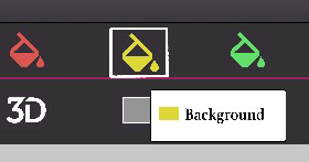
We need to make sure that it is clear as to what the button does. Since our buttons are more visual (icons) we will develop a hover feature in order for it to be more obvious as to what our buttons do. This will help communicate with our users about what the buttons are meant to be used for, cancelling out any misuse or confusion.
We went on to develop a hover feature that highlighted the name or action of what the button does once the user hovers over the icon. The button also becomes highlighted once the user has pressed it, letting them know what icon they are currently using.
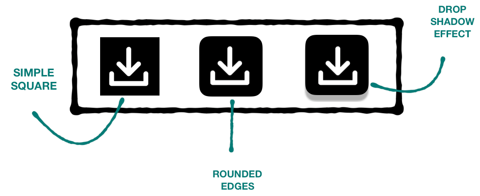
SIZING
Button size should reflect the priority of this element on the screen. Large buttons usually connote towards more important actions than smaller buttons. We need to take this into consideration and make sure that we are sizing our buttons according to importance.
BRAND IDENTITY
Lastly, we wanted to ensure that our page was more attractive to users than before. With developing the layout a bit more we thought that we should also develop our logo and make it look slightly more attractive. If this was a real business that we put out into the world, brand identity would be the first thing the users usually get attracted to, hence why we created a logo and mission statement for our application’s services.
We decided to make a new logo for PlotSole, which we hoped would give us an idea of how we then wanted the rest of our application to look. This re-design of our logo also encouraged us to create a whole new layout design that suited our current services that we want to provide to users.
View the prototype development in Creative Process or click the button at the top of the page
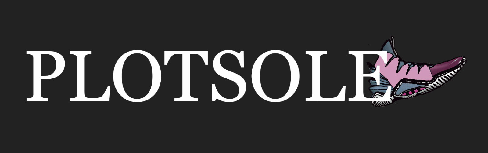
OLD LOGO
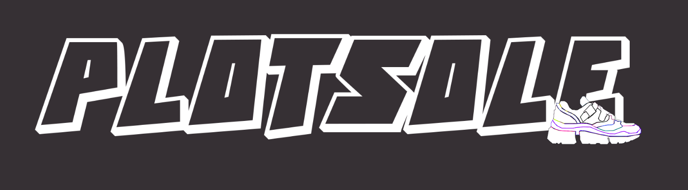
NEW LOGO